


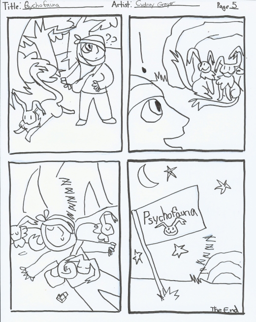
Tag Archives: 2016 Cydney Grayer
Cydney Grayer
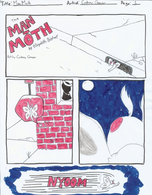


Cydney Grayer


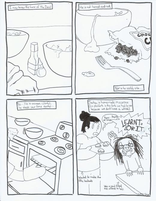

Cydney Grayer: The Crow by James O’Barr
James O’Barr’s The Crow is one of the many pop cultural and graphic novel characters and stories you hear about growing up. But as this was my first time actually reading the book and getting a good look at it, I can understand why. I would most likely chalk its popularity up to the art style and overall presentation of the story in general. For starters, the book’s segments are notified by poetry: Every chapter ends with some sort of verse that correlates with some aspect of what is to happen in the next chapter. Maybe this was added in the later years? Even if it wasn’t, the antihero, Erik, holds enough dramatic characteristics on his own. Erik himself is poetic in a way that only a fictional character (or really wordy and dramatic real person) could be, describing himself as being able to feel pain “at a molecular level” and that it “sings to [him] in an alphabet of fear” (seriously, who says it like that?). It doesn’t help that his image mimics that of the masks Shelly had used to decorate their home. Though, to be honest, the art that Erik’s Crow persona is stylized in makes him look more like a cross between the Joker and David Bowie. Come to think of it, I suppose the phrase “caught-between” would be appropriate to help describe this comic: It’s constantly caught between things. The style in general looks like some sort of fusion between two different styles of drawing; like if western-style cartooning got caught between with Japanese-styled manga. (I mainly draw that last one because of the peculiar eye formation and some expressions carried by the characters.) But I digress. In addition to Erik’s very 80s aesthetic, the way his body is constructed is very reminiscent of a dancer’s. What comes back to memory is the previously shown interview with James O’Barr himself, explaining that rather than using models or whatever else other artists were using to learn to draw bodies, he taught himself how to draw using Greek statues. While this may not be as apparent in some frames, this because very clear in panels that tend to have Shelly in them, considering that whenever Shelly is present, the strokes become smoother and the bodies become softer and curvier-looking. Whether or not this was intentional is anyone’s guess. However, as The Crow was the result of O’Barr grieving over someone extremely important to him, this was possibly highly intentional to convey to the audience just how he and Erik (his avatar) saw the world when their respective women were still alive. The only pages exampling color were splash pages located in the back of the book, meaning everything else was entirely black and white. For the time The Crow came out, this would have been passable but nowadays, with more graphic novels being printed in color or having a style that at least uses minimal color for indication, it stands to say that O’Barr had to be very certain of his designing. The shadows have to work just as well with the light to properly convey a figure. All in all, however, these characteristics work quite well to convey the dreariness and grittiness I’m sure O’Barr wanted to get across (even if it’s through such a peculiar-looking and hammy character).
Cydney Grayer: Through the Woods by Emily Carroll
While the title initially would convince a potential reader that the story content would be more on the humorous side a la Sondheim’s musical Into the Woods, Emily Carroll’s Through the Woods proves to be quite the opposite. On the initiation of its presentation, the book itself, while definitely a graphic novel of sorts, is actually not one consecutive story. Instead, Through the Woods contains a small collection of fairytale-like stories with increasingly dark material ranging from a trio of sisters encountering a smiling man with a wide-brimmed hat and disappearing soon afterwards, to a newly-wedded bride discovering the spiteful corpse of her predecessor, to a girl whose friend is possessed by an entity that appears to travel through touch, to a seemingly unimpressive man slaughtering his brother out of anger, to a weary girl’s encounter with her brother’s fiancée with more than questionable dental. While each story is interesting on its own and carries some depth of mysticism and Gothic nature, a lot of the publication’s notability comes in the form of the stories’ art styles.
While each story made use of the space provided, often leaving restrictive paneling to further get across the mood of the story, each piece actually had differing styles that could have been either subtly divergent from the last or dramatically different. The stories whose respective styles stood out as examples would be Our Neighbor’s House, His Face All Red, and The Nesting Place. While nearly every story in the entire book had no shortage of earthy tones, Our Neighbor’s House appeared to be the story that used the most of it to its advantage. The bleakness of winter as well as the distraught nature of the girls’ story was especially apparent through muddied colors, with red and white being the only stand-out tones present throughout the entire piece. In addition to this, detail was put in every aspect from hair locks to eye bags to floorboards. In an almost complete stark contrast, however, is His Face All Red. The story has a peculiar mix of aspects in terms of art: The designs are more angular than rounded and aside from a detailed sheep corpse, there’s not much in the way of making the art appear three-dimensional. In addition to this, the narrator is designed distinctly different compared to the people that surround him. His image is the roundest, probably to push the idea that he’s unimpressive and even doughy compared to his more successful brother and, most notable, his eyes are blank – like a certain ginger-haired orphan girl from the Depression.
Probably the story that deviates the most from the previous two is The Nesting Place. For starters, the story actually has a set time unlike most of the other pieces which choose to be vague to keep timelessness. On that note, The Nesting Place takes place during the 20s and the art style actually resembles the charcoal draft pieces reminiscent of that era. At the very least, while the line sketches of the previously mentioned comics were more distinct and cleaner, this comic’s likeness is constantly filled with rounder, softer sketch marks and outlines. It creates a vintage feel not completely unlike that of the fairytales but one that can subconsciously be associated with a distinct time period.
Cydney Grayer: With Eyes Closed
A series of drawings done in class with eyes closed and with the non-dominant hand.


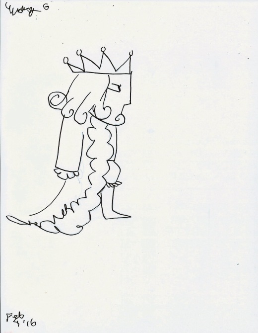


Cydney Grayer


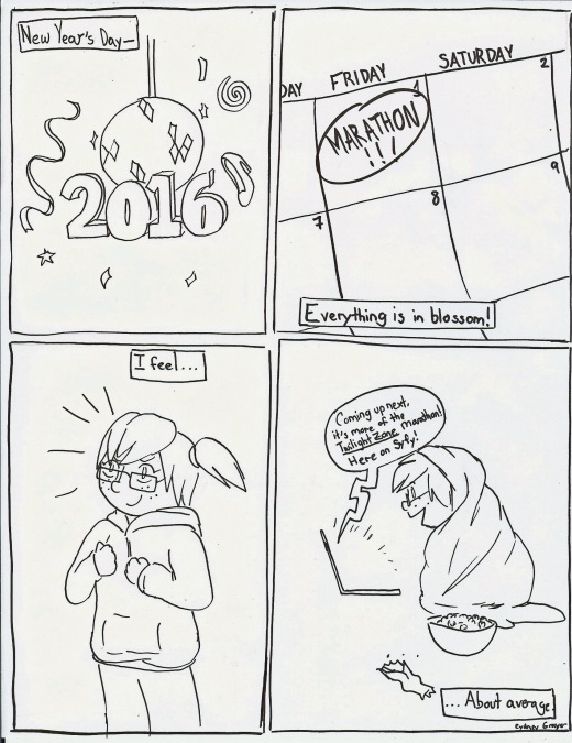
Cydney Grayer: Comics as Haiku




Cydney Grayer

